Counsel Health

Making AI healthcare fast and safe
Patients want quick answers to health concerns. But accurate AI-supported care requires medical context, which takes time and effort for patients to provide.
This project explores how to guide first-time users to share enough medical history to begin care confidently, without slowing them down or creating drop-off.
-
When users seek care for the first time, Counsel needs basic medical background (conditions, medications, allergies, etc.) to deliver safe recommendations and support clinicians downstream.
Patients currently have three ways to add this context:
Connect provider portals (Fasten API): fastest and most complete, but can be difficult if users don’t remember logins or providers aren’t available.
Authorize HIE sync: easy to approve, but records take time to review before they can be used.
Manual entry: always available and immediate, but requires the most effort.
We want to help patients understand why sharing this information is valuable, guiding them toward the right option, and defining what is “good enough” medical history to begin care.
The experience also needs to adapt to different medical needs while collecting information that is useful for both AI recommendations and clinicians.


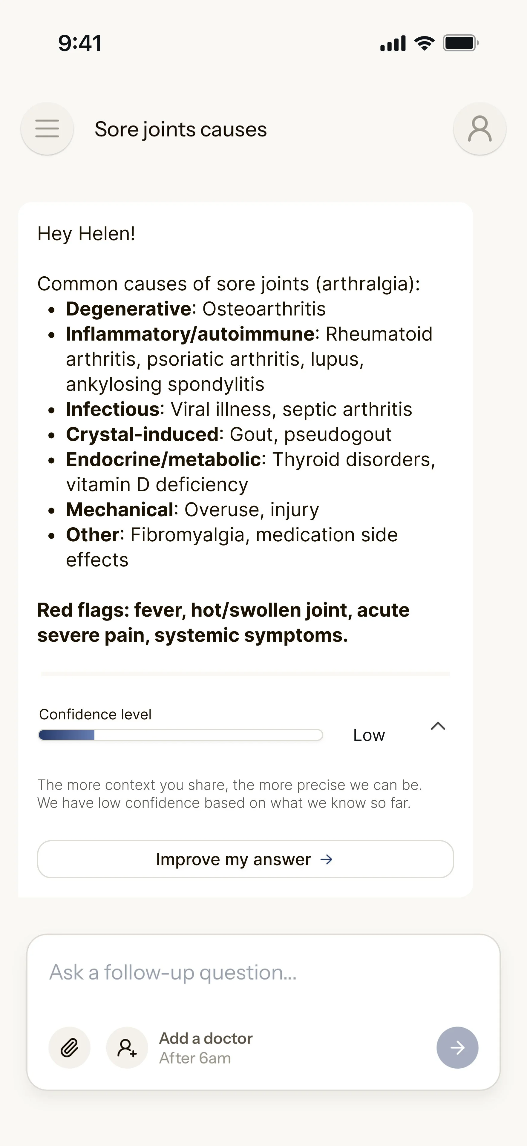
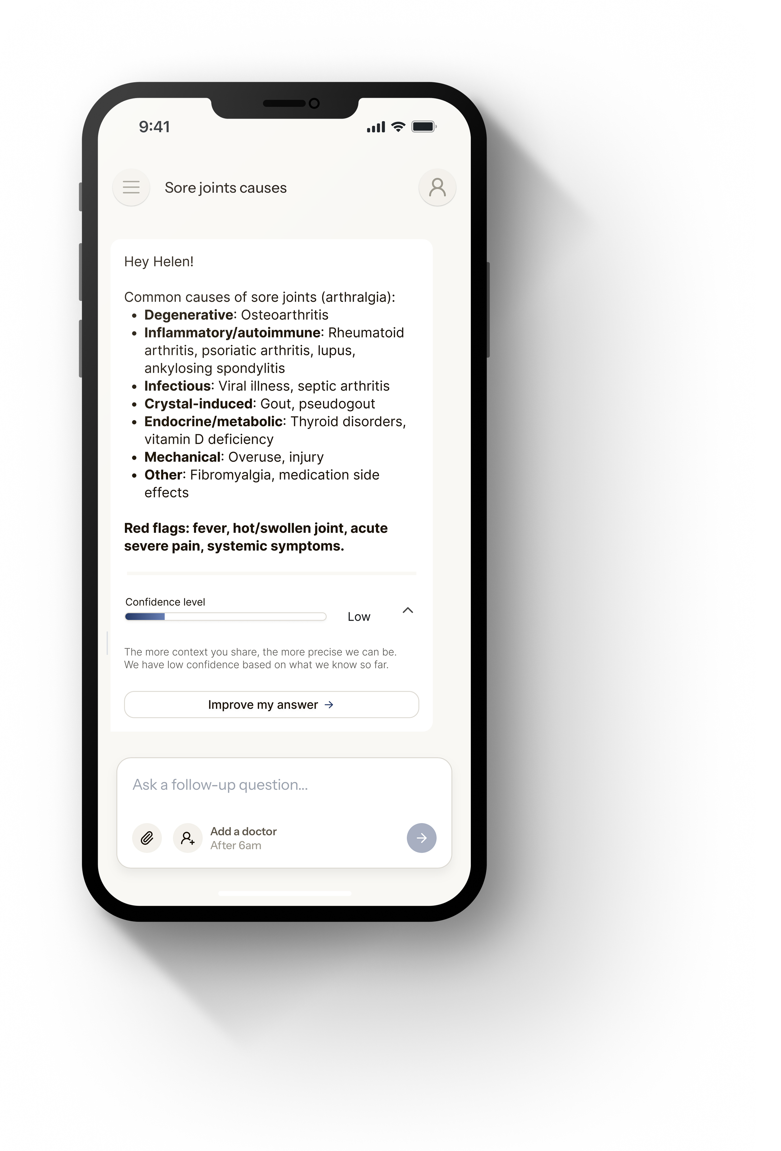
“Ok google… what are possible causes for sore joints?”


The loop to fix
-
Step 1
Patient enters with a concern
-
Step 2
The system needs context
-
Step 3
Gathering context → friction
-
Step 4
Friction risks abandonment
-
Step 5
Less data → worse guidance
-
Step 6
Worse guidance → less trust
How do we balance

Speed vs. completeness
1
Autonomy vs. guidance
2
Trust vs. data collection
3
One-time usage vs. relationship building
4

Competitive analysis
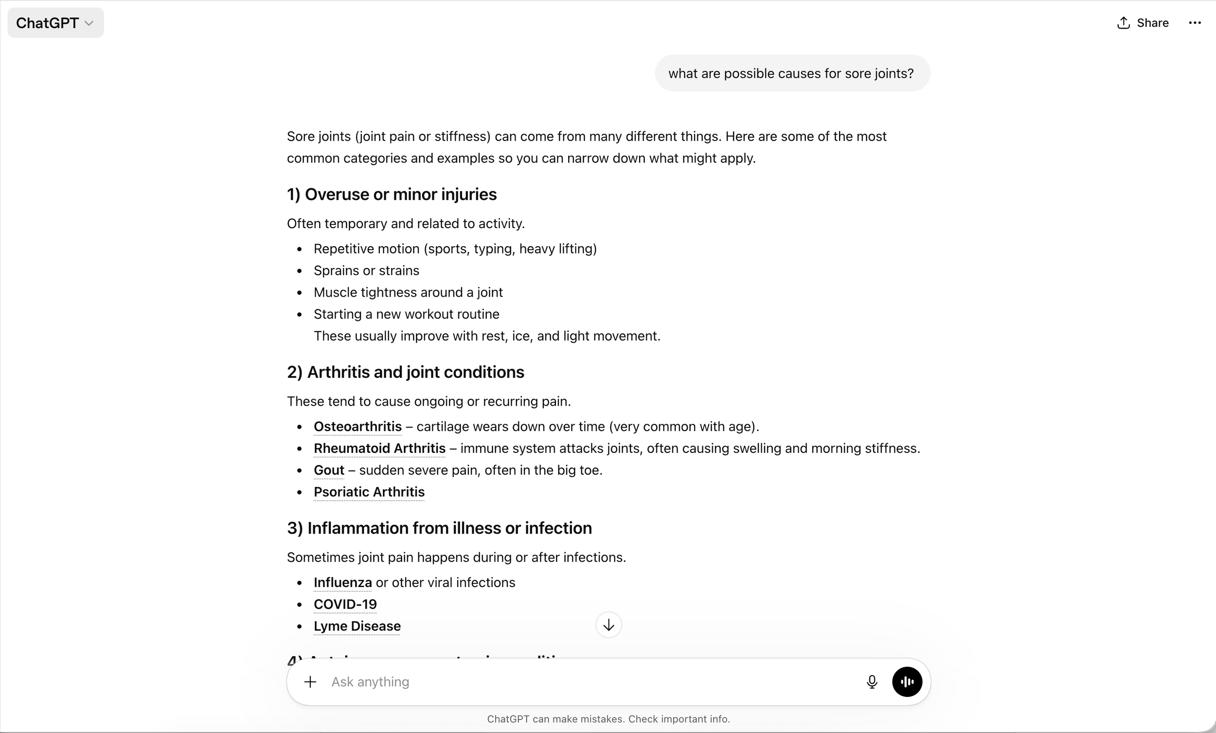
Chatgpt
Low accuracy, but quick responses
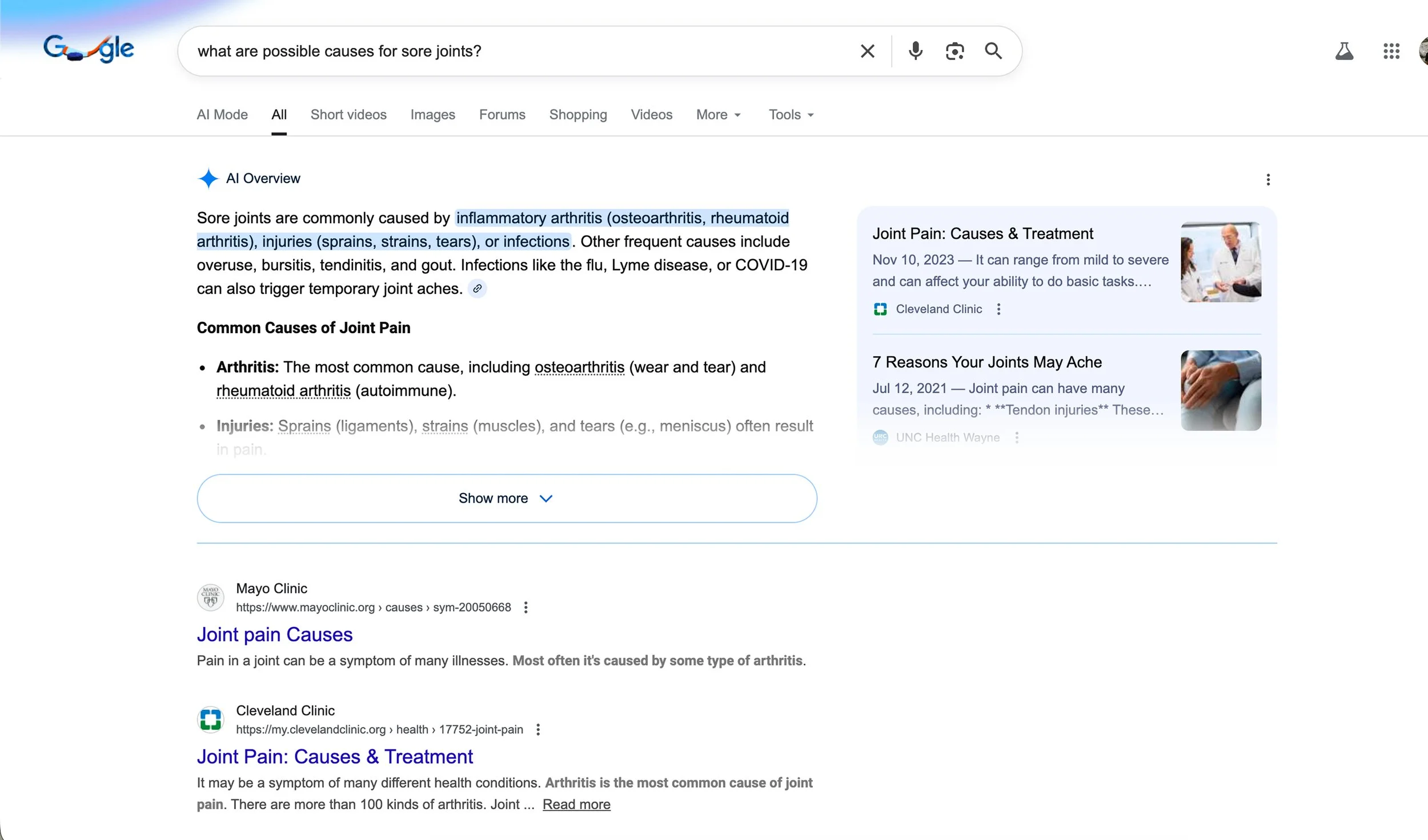
Google search
Hard to find relevant content
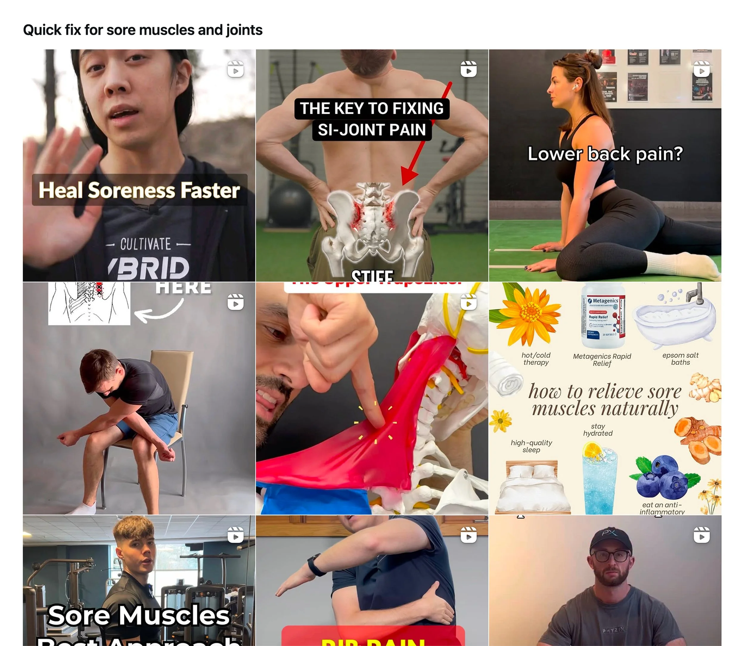
Instagram + Tiktok
Entertaining + keeps you around

Hypothesis
If we allow patients to begin care immediately and visually demonstrate how additional information improves answer confidence, they will voluntarily provide richer medical context.
What does success look like?
Business
Reduced drop-off
Higher return likelihood
Increased data richness
Patient
Feels heard immediately
Receives actionable insight quickly
Understands why context improves care
Is in control of data
Clinicians
Receives structured, usable context
Avoids unsafe assumptions
Reduces back-and-forth clarification
A flow that competes
We need to offer what other companies offer which is speed and dopamine hits. But the difference of this flow lies in the invitation.
How can we show the patient the value of increasing accuracy?
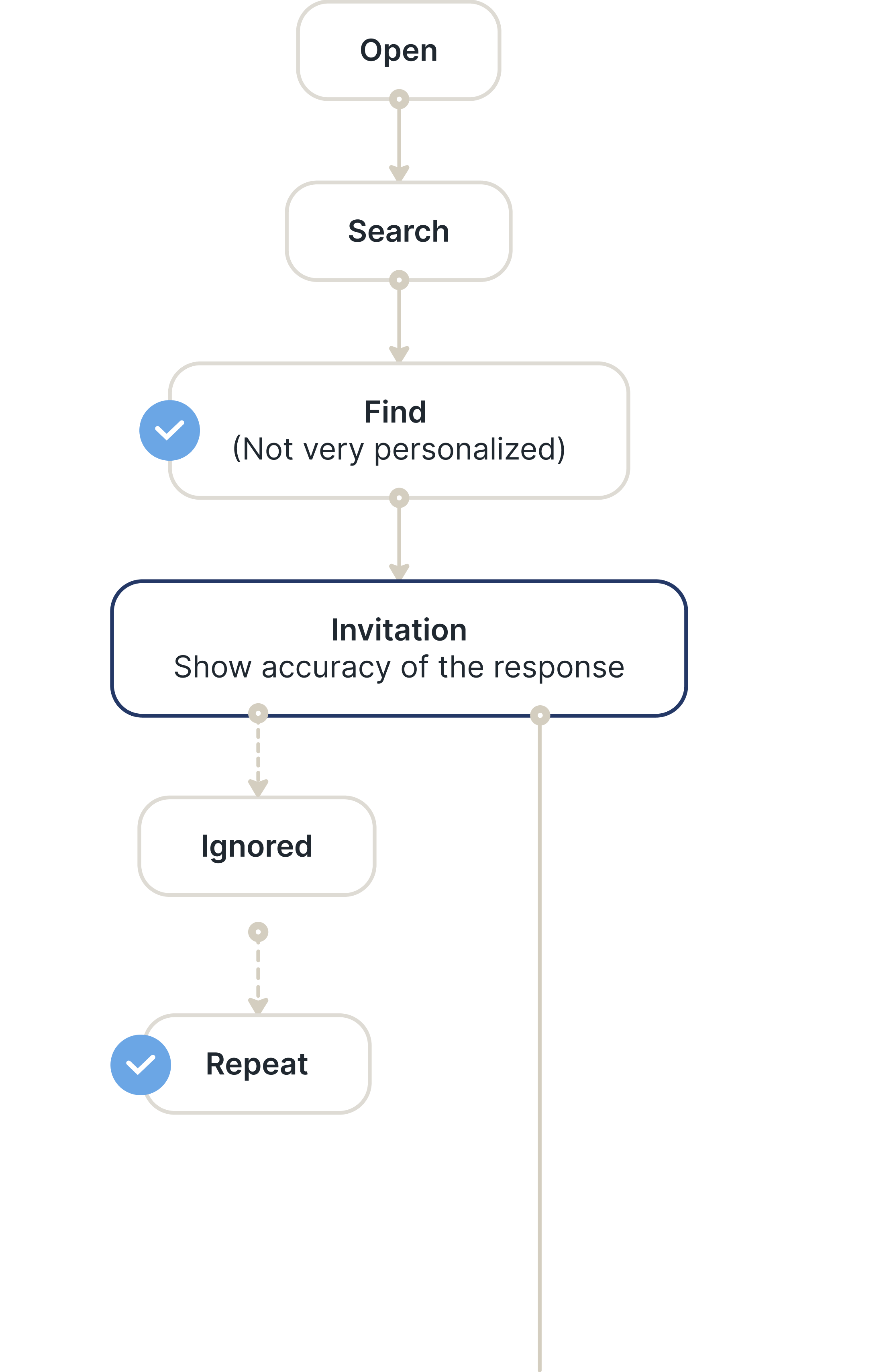

Problem 1: The invitation
I explored a visible feedback loop that shows how additional context improves care precision. It communicates:
Transparency
Safety
Professionalism
Non-judgment
User control
It says:
“We’re not pretending to know everything.”
And that builds trust.
Invite iterations
-
![]()
01
-
![]()
02
-
![]()
03
-
![]()
04
-
![]()
05
-
![]()
06
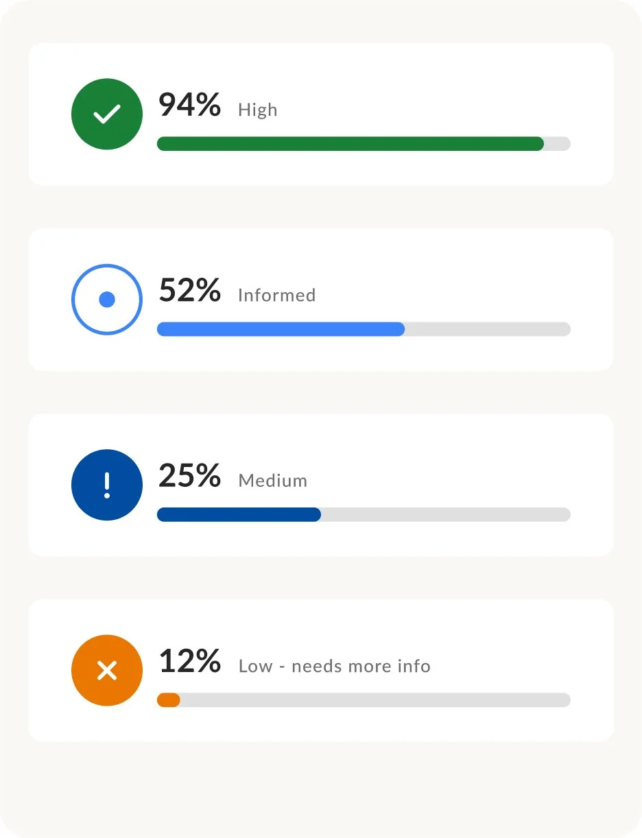
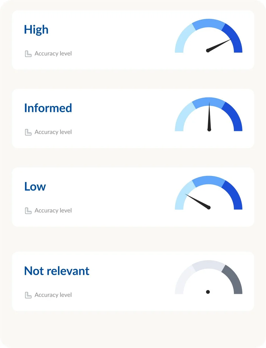
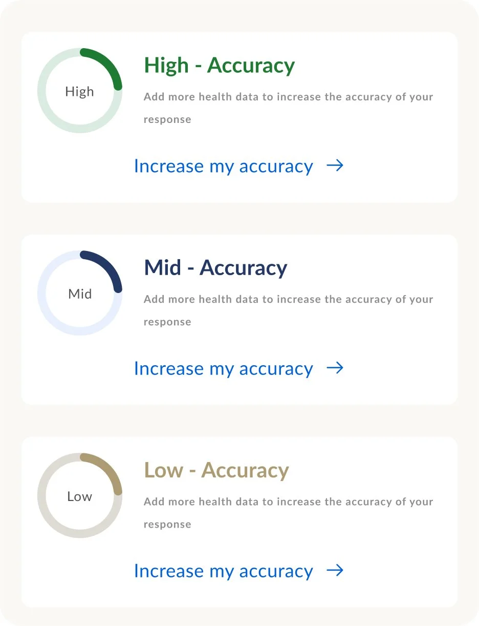
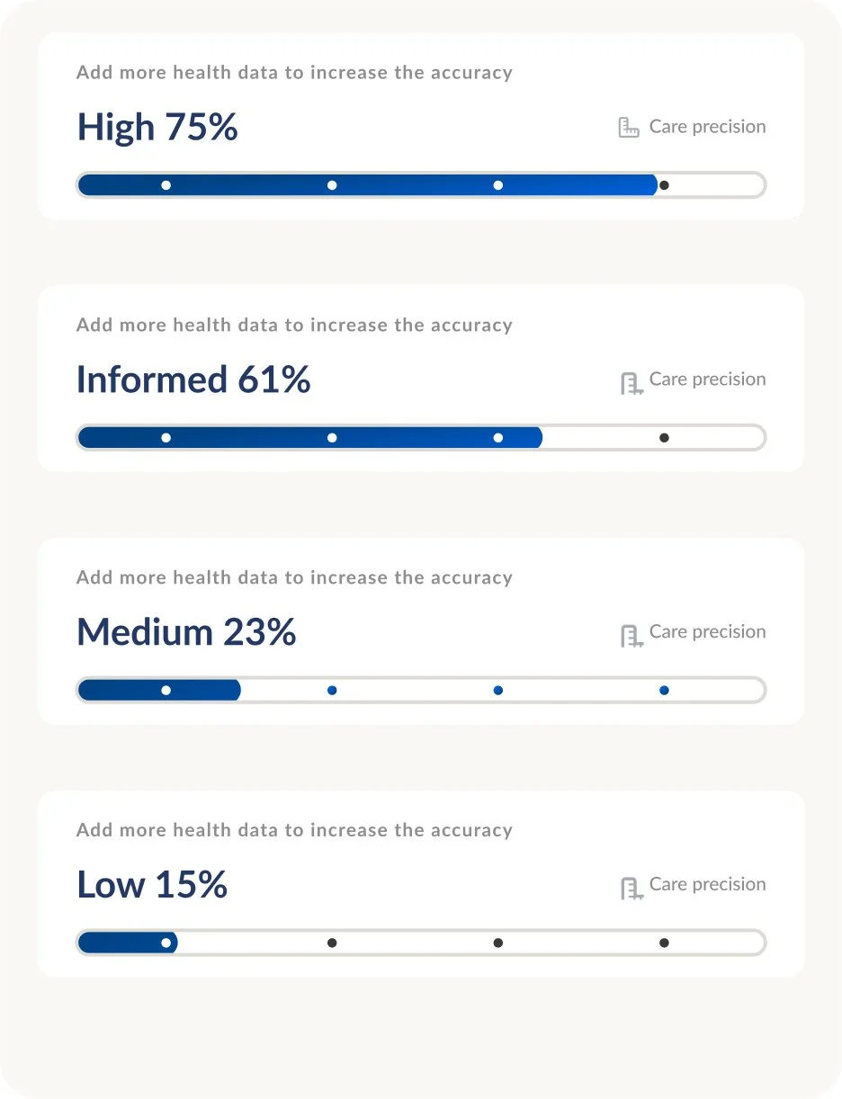
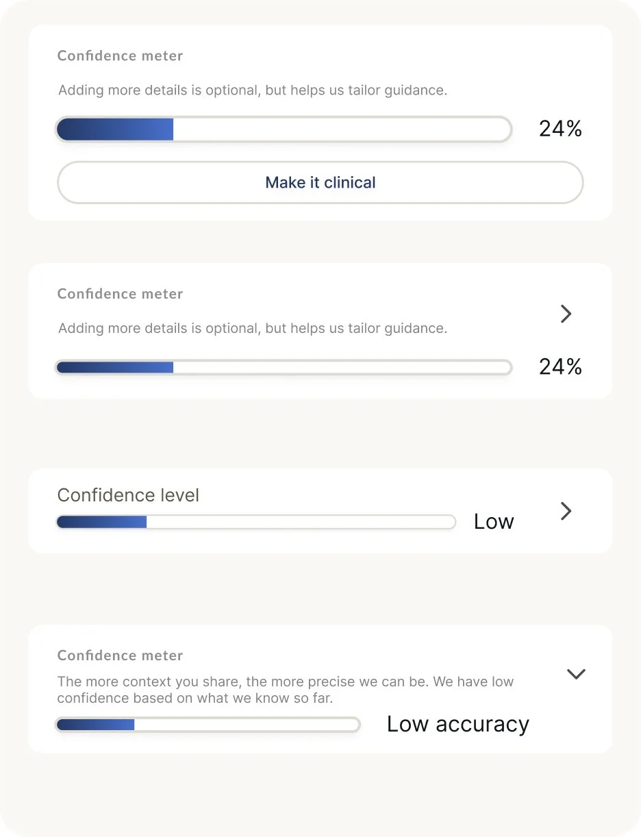
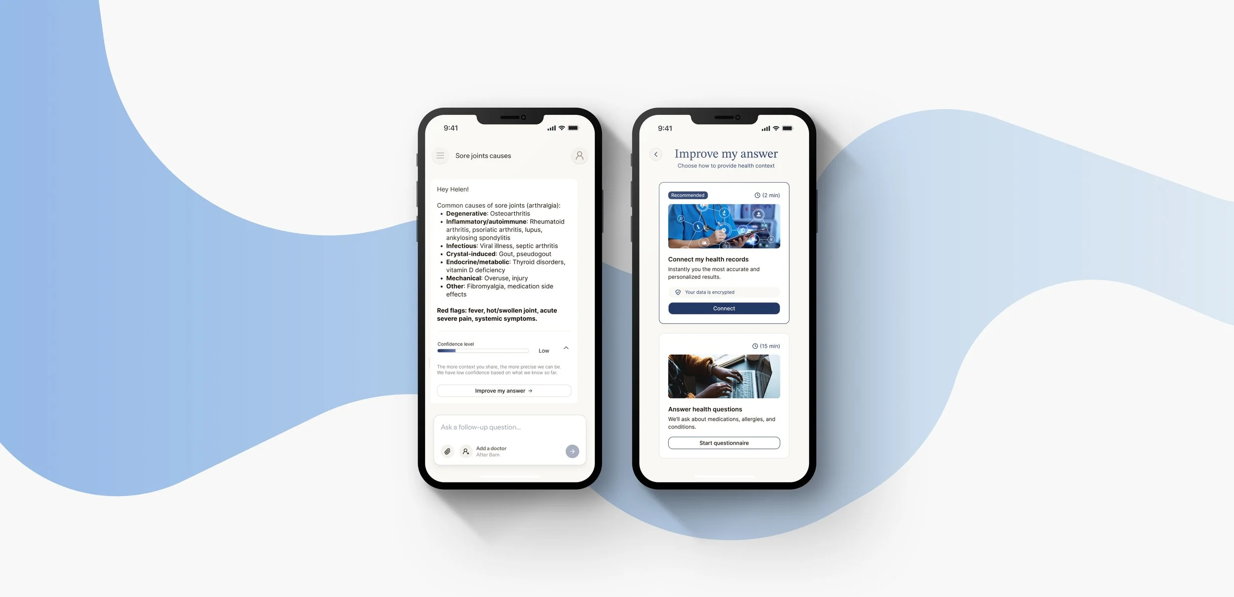
Invite utilizing a confidence level
Note: I avoided using percentages because imprecise numbers can reduce trust. Instead, I use clear levels to communicate progress more reliably. This is so patients can understand where they stand without relying on estimates that may feel arbitrary.
Confidence level examples
“Common causes of sore joints may include: …”
— Low level“Given your age, a likely cause of sore joints is: …”
— Informed level“Based on your current medications and thyroid history, the likely cause of your sore joints is: …”
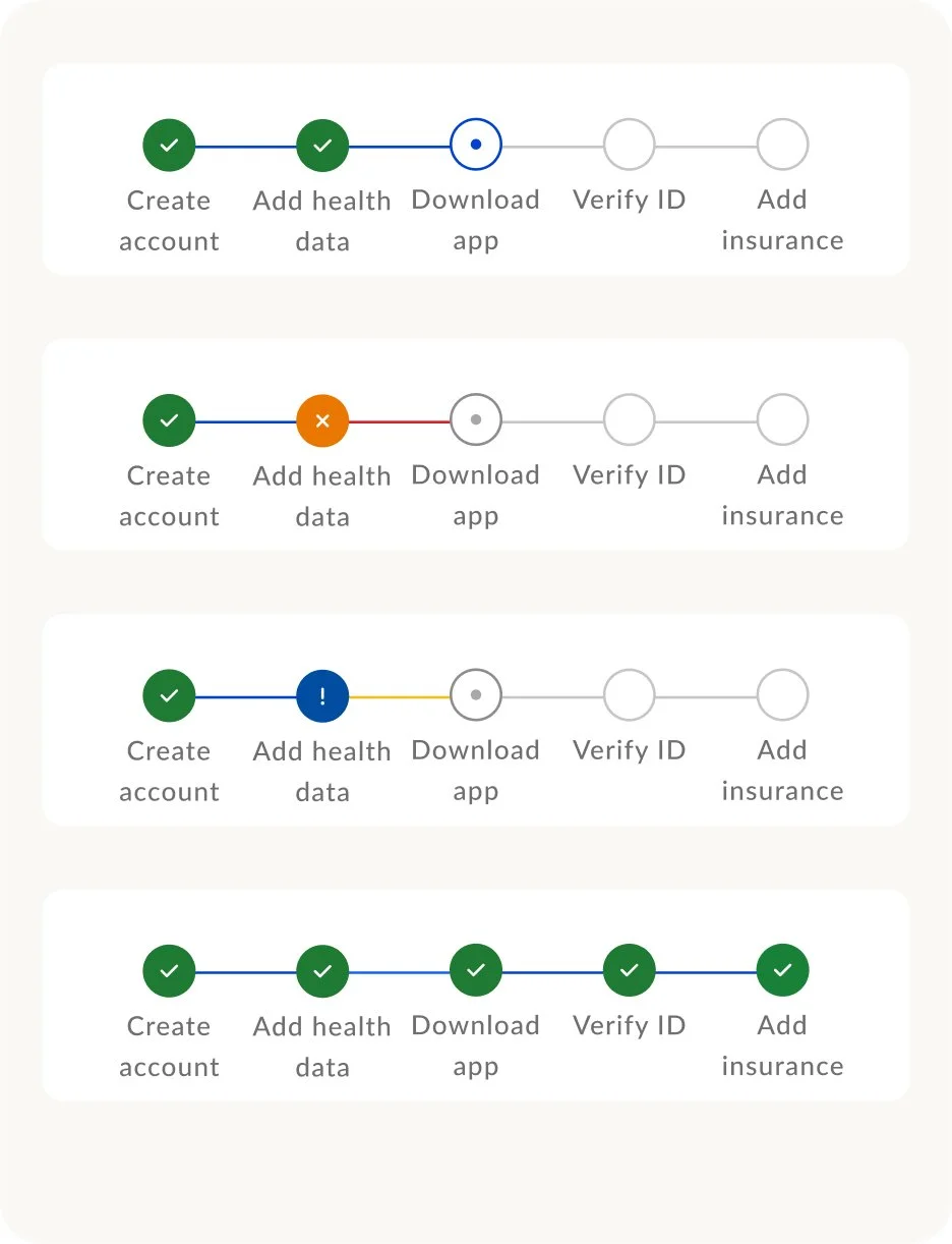
— Highly personalized levelAutomate health data
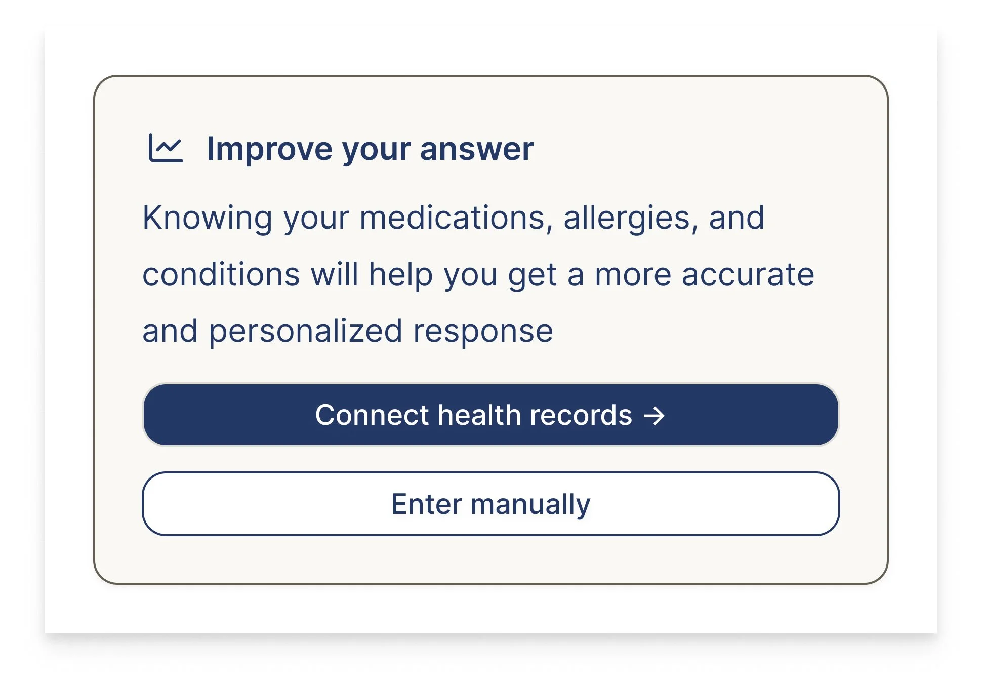
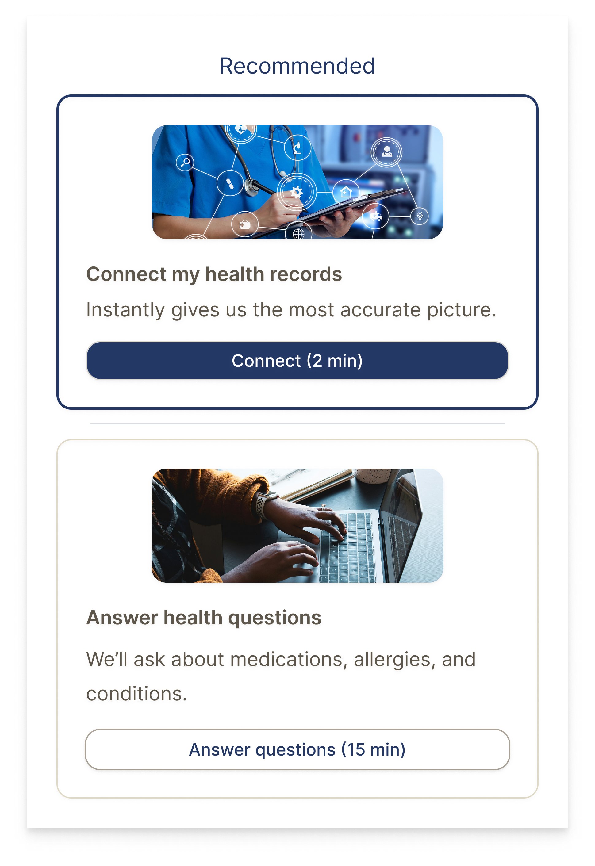
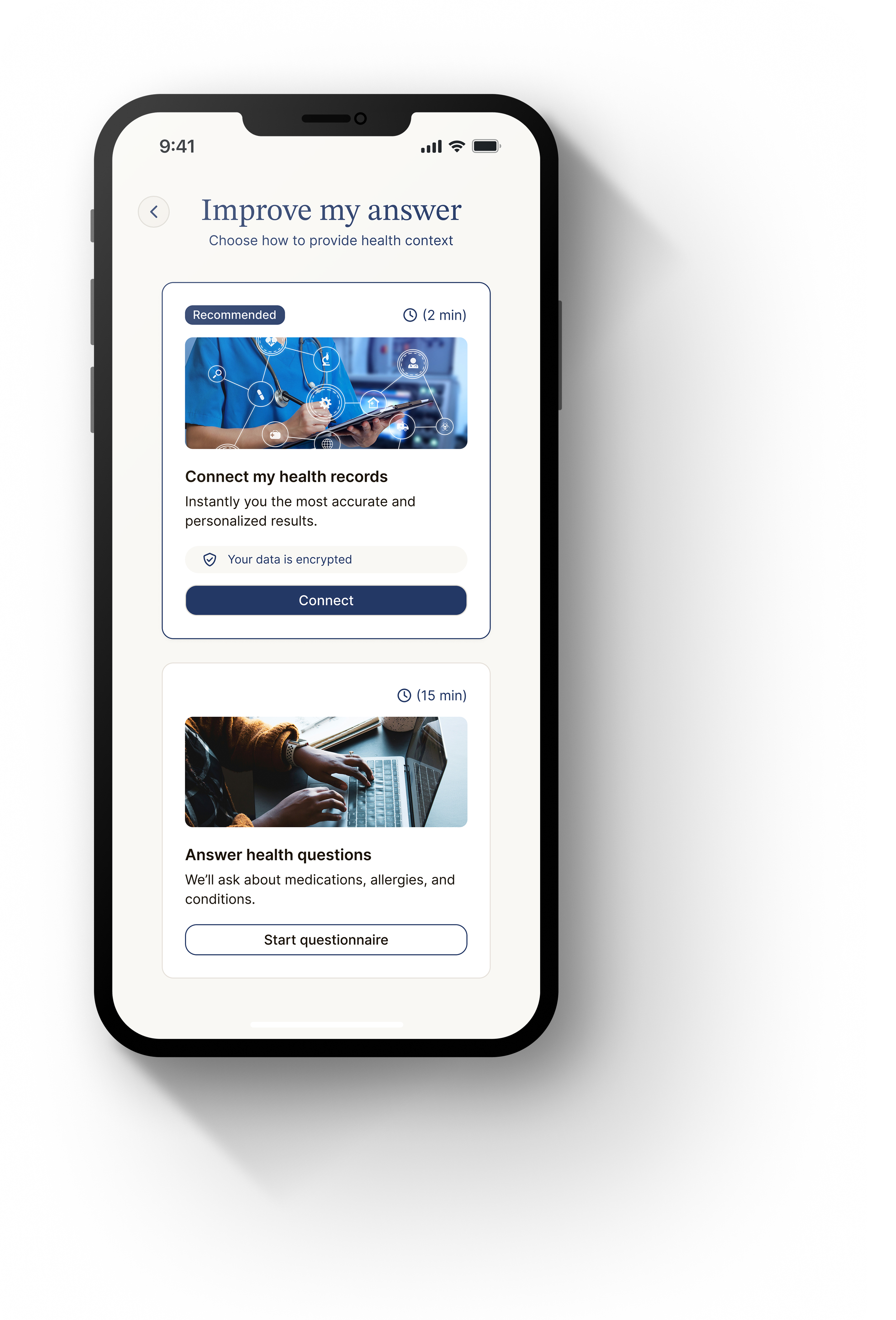
As we continue in the flow, this patient sees the value in increasing their accuracy, now they can either automate, or manually add their health records.
How can we show the patient the value of automation?
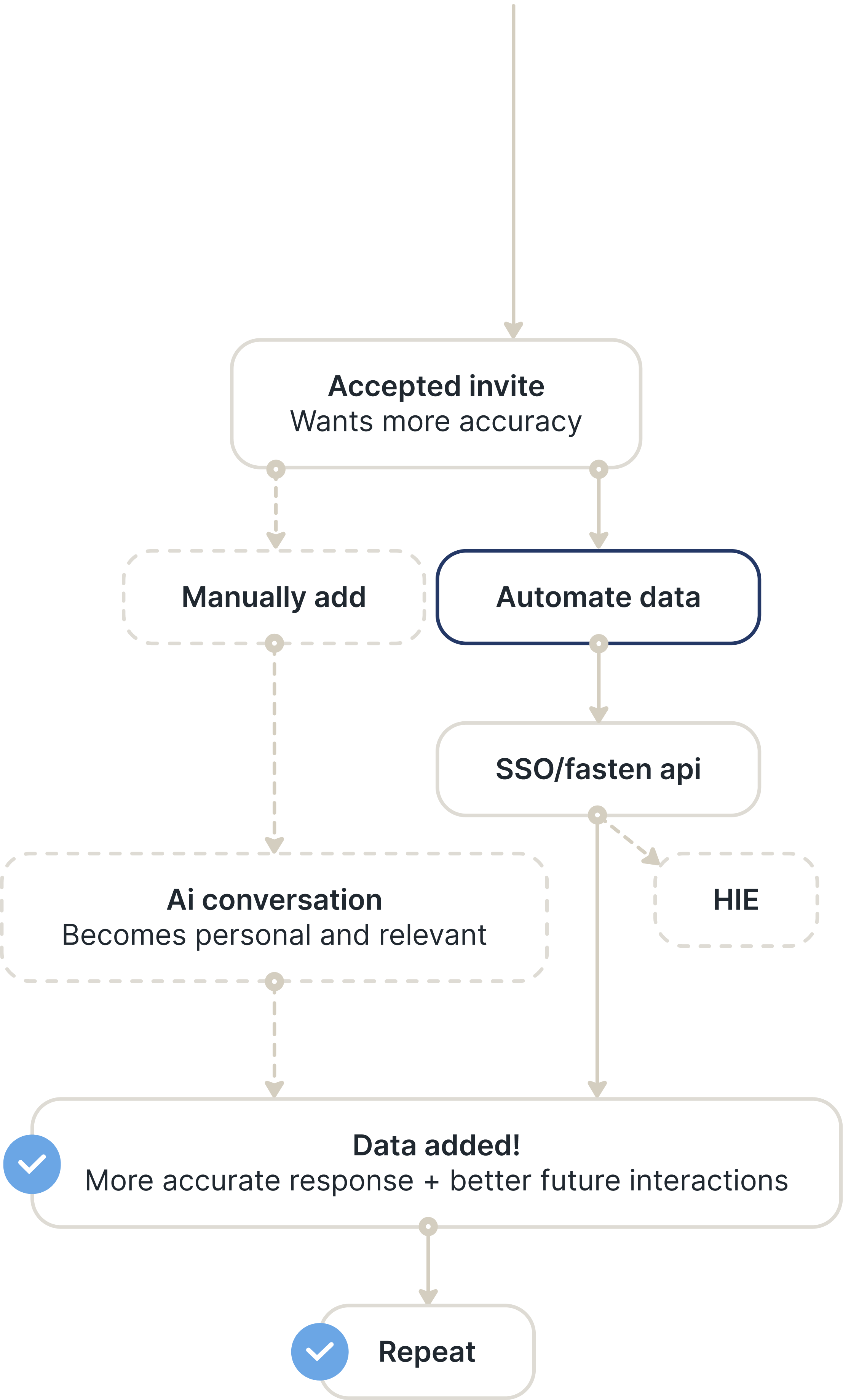

Problem 2: Data gathering
Hick's Law
The more options there are, the harder it is for users to take action, so we’ll limit it to two options here.
Primary path → Fasten API (I would want to validate connection success rates before continuing in this direction.) HIE gets recommended only if connection struggles are detected or if Fasten returns little data.
Data gathering iterations
I played with splitting the options into 2 and explaining the difference with supporting icons.
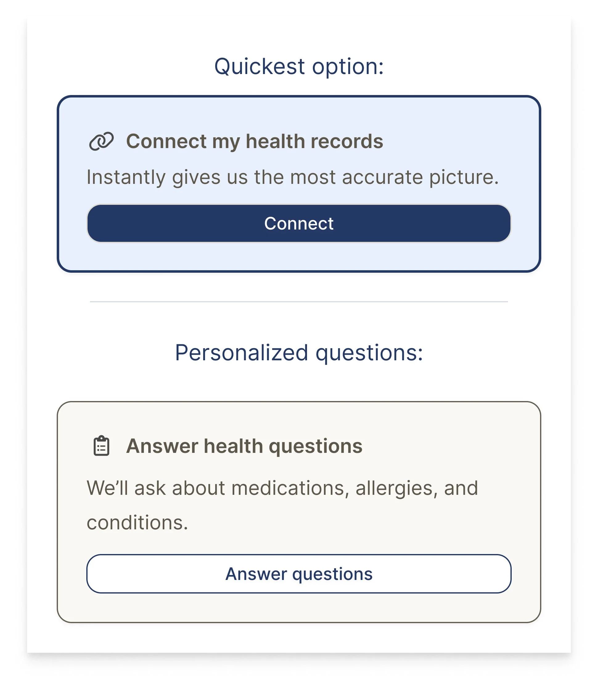
Iteration 1I also played with keeping it in the same card and utilizing buttons to separate the two commands.
Iteration 2Using images better aligned with Counsel Health branding.
Keeping the 2 options separate highlights better the value of automation.
Iteration 3Data gathering
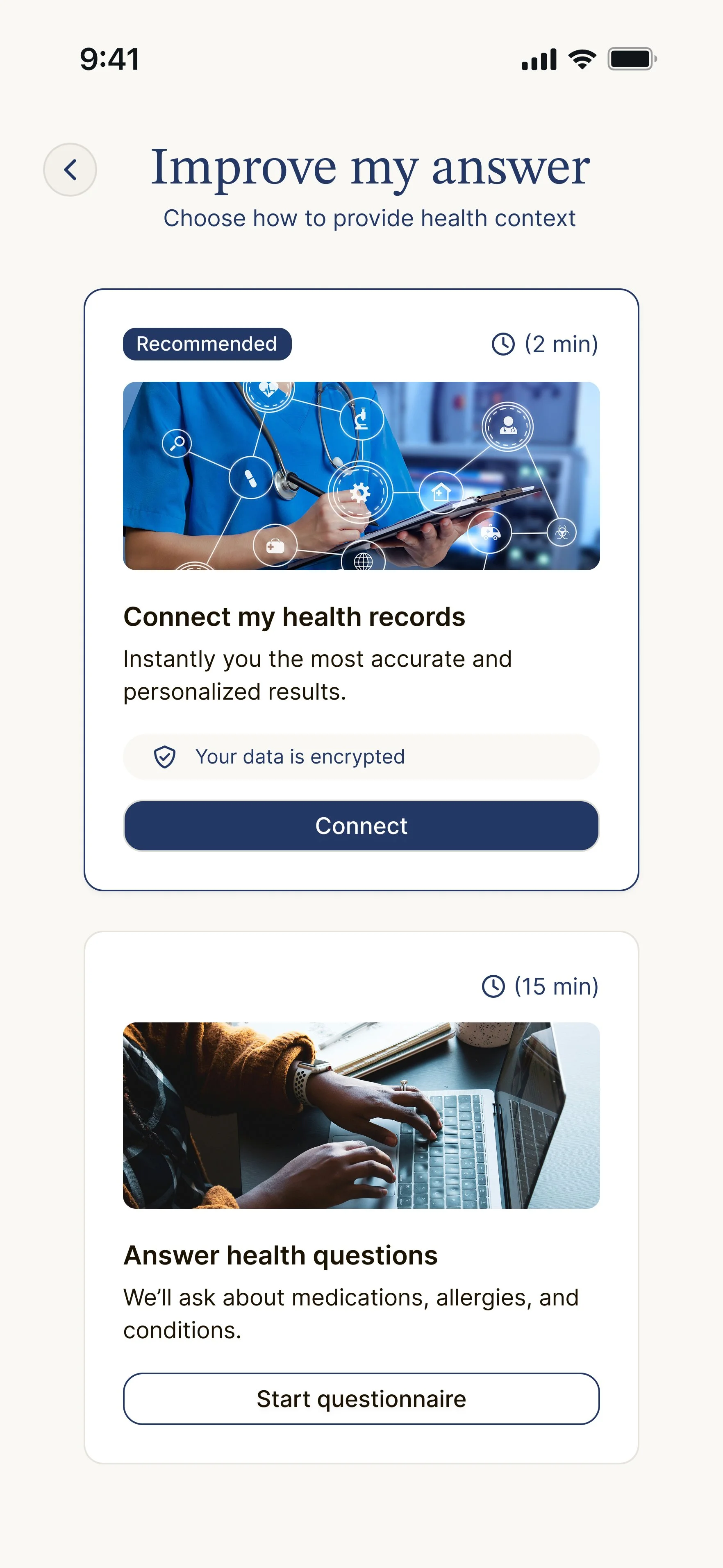
We aim to respect and support members throughout their journey by giving them meaningful choice rather than forcing a single path.
Maintaining user agency at every step helps people feel more in control - especially in healthcare, where decisions can feel overwhelming.
By offering clear options instead of rigid direction, we also reduce cognitive load in high-stress moments, making it easier for members to move forward with confidence.

Ai prototype
I played around with AI to quickly show the flow of how to connect health records in a way that shows value to users
How it was built
🎨 Figma designs (built with custom design system)
🤖 Tested AI-assisted prototype tools (V0 + Figma Make)
💻 Code-backed components (Shadcn)
🏞️ Unsplash ( stock photography)
🩸 Blood, sweat + tears

Why you should hire me
I excel at designing complex, multi-system product experiences that feel effortless for users.
I bridge product strategy, UX architecture, and visual execution, giving teams clarity and direction.
I design with business outcomes in mind, utilizing habit formation, engagement loops, and reward structures.
I’m comfortable owning entire features end-to-end, collaborating deeply with PMs and engineering, and delivering work that is both strategic and lovable.
My goal is always the same: design products people come back to every day because they want to, not because they have to.
Reach out and I’ll show you more of my work :)